HOSPITALITY INNOVATIONS
MOBILE APP
I began full-time work with early-stage startup, Hospitality Innovations, in June 2021 as their only UI/UX designer. Working with software engineers and hospitality workers, I conceptualized and designed the experience of this new app from just an idea all the way through launch.
A lot of the hospitality industry is still on pen and paper.
Restaurants and hotels are stuck in the past with back-of-house operations, such as taking inventory, placing orders, managing their teams, etc. Many of these tasks are still done on clunky spreadsheets and even pen and paper.
The vendors they order from are not much better. Their pricing lists are often inconsistent and in varied formats across the industry. This makes it challenging for purchasers to understand the full breadth of their own inventory, and nearly impossible to compare all of the options available in order to make cost-effective purchases.
The vendors they order from are not much better. Their pricing lists are often inconsistent and in varied formats across the industry. This makes it challenging for purchasers to understand the full breadth of their own inventory, and nearly impossible to compare all of the options available in order to make cost-effective purchases.
That's where Hospitality Innovations comes into play.
Hospitality Innovations is a software solution that allows businesses to understand the full breadth of their inventory, place well-informed restock orders, and manage their team all in one place. It also allows vendors to keep their availability an up-to-date and manage their orders coming in and out seamlessly.
My job was to design the look and feel as well as the user experience from the ground up. I also worked with software developers throughout the design process to ensure the design's implementation would be both feasible and efficient.
My job was to design the look and feel as well as the user experience from the ground up. I also worked with software developers throughout the design process to ensure the design's implementation would be both feasible and efficient.
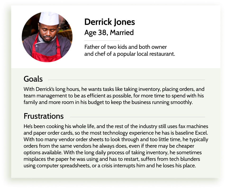
Informed by hospitality workers.
Throughout the design process, I talked to current and former hospitality industry workers.
I learned what tools they use now, and how they only have a few seconds to complete most tasks. Working in hospitality is chaotic with frequent distractions that interrupt tasks and cause confusion and disorganization.
Some questions I asked: What's a typical day like for you at work? What's the most irritating part about taking inventory now? How do you decide what to order?

"Working in hospitality feels like I'm constantly putting out fires. When I'm in the middle of something, I have about five seconds until I get a phone call or I'm needed elsewhere."
- Current hospitality worker
Complex data sets needed to be digestible.
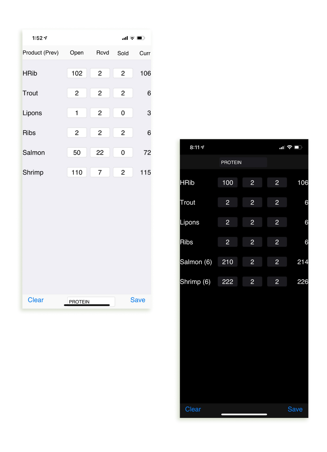
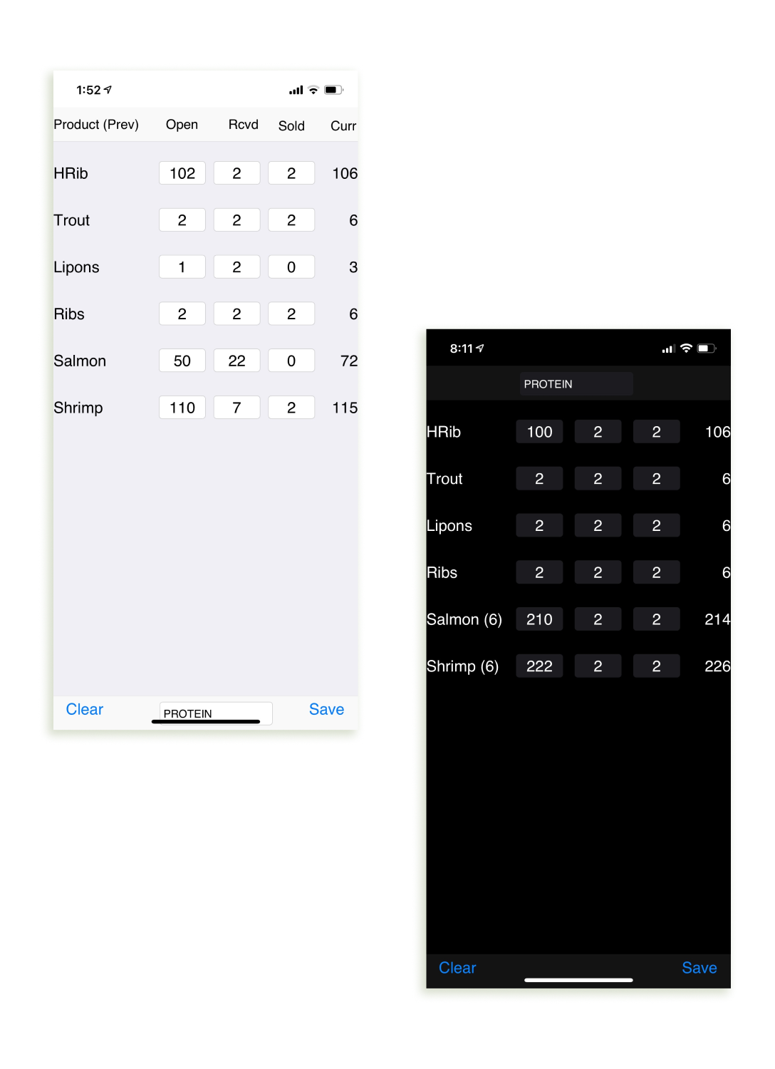
The following pictures show the basic user interface I had to work with initially. It shows the quantities of various items in their inventory, the number sold to be deducted from their count, any new inventory, the net total, and the total yesterday.
From here, I needed to come up with a way to display the same complex set of information in a digestible, organized, and modern-looking way to set this view apart from a standard spreadsheet.
Since our target users typically used little to no technology for their work, the layout needed to be so intuitive that even the least technologically experienced user would have no trouble.
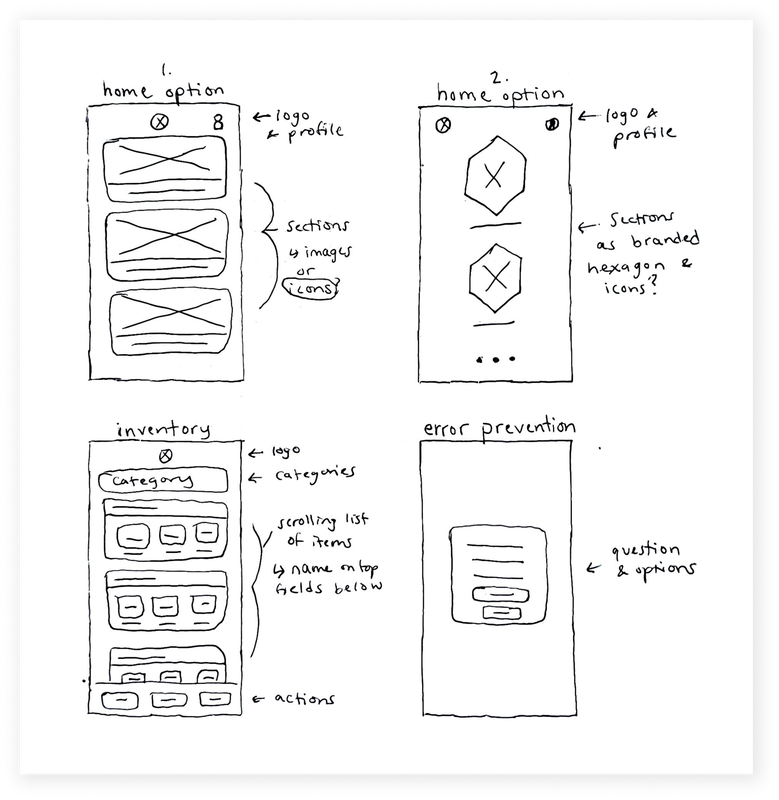
I started sketching minimalistic layouts.
The target users' limited time, unfamiliarity with modern interfaces, and frequent distractions showed me that the actions on the app needed to be quick, have robust error prevention, and be so simple that they could be interpreted at a glance.
This fueled my initial rough sketches of concepts to incorporate. My key goals were simplicity, consistency, and transparency.
This fueled my initial rough sketches of concepts to incorporate. My key goals were simplicity, consistency, and transparency.

Balanced colors to highlight just the essentials.
Using their existing brand colors, my design focused on displaying only what's necessary. Their red and black colors were used sparingly to add emphasis to important areas on the page, using subtle grey and stainless steel to add dimension and uniqueness as an homage to the steel kitchens you would see working in a restaurant. I also added an additional blue to the set of UI colors to use in small areas, wielding the contrast as a differentiator.

Structured by cards with a purpose.
To modernize an industry powered by mundane spreadsheets and messy pen and paper, I designed a system that felt familiar, yet easier to understand.
The general grid structure of a card system with fields the user can manipulate is reminiscent of a spreadsheet, yet the cards allow the user to see relevant groupings of information at a glance and prevents them losing their place when distracted. For example, in a card structure, the user will never confuse "2 ribs sold" with "2 trout sold".
What the user needs to click is bigger, and what is being shown is easier to make sense of. This structure is seen throughout the app anywhere that the user needs to interpret and manipulate various groups of information.

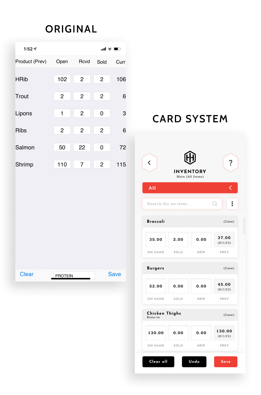
The simple and cohesive card layout makes for a more consistent and intuitive experience, as well as making designing and engineering more efficient.
Taking inventory is now a no-brainer.
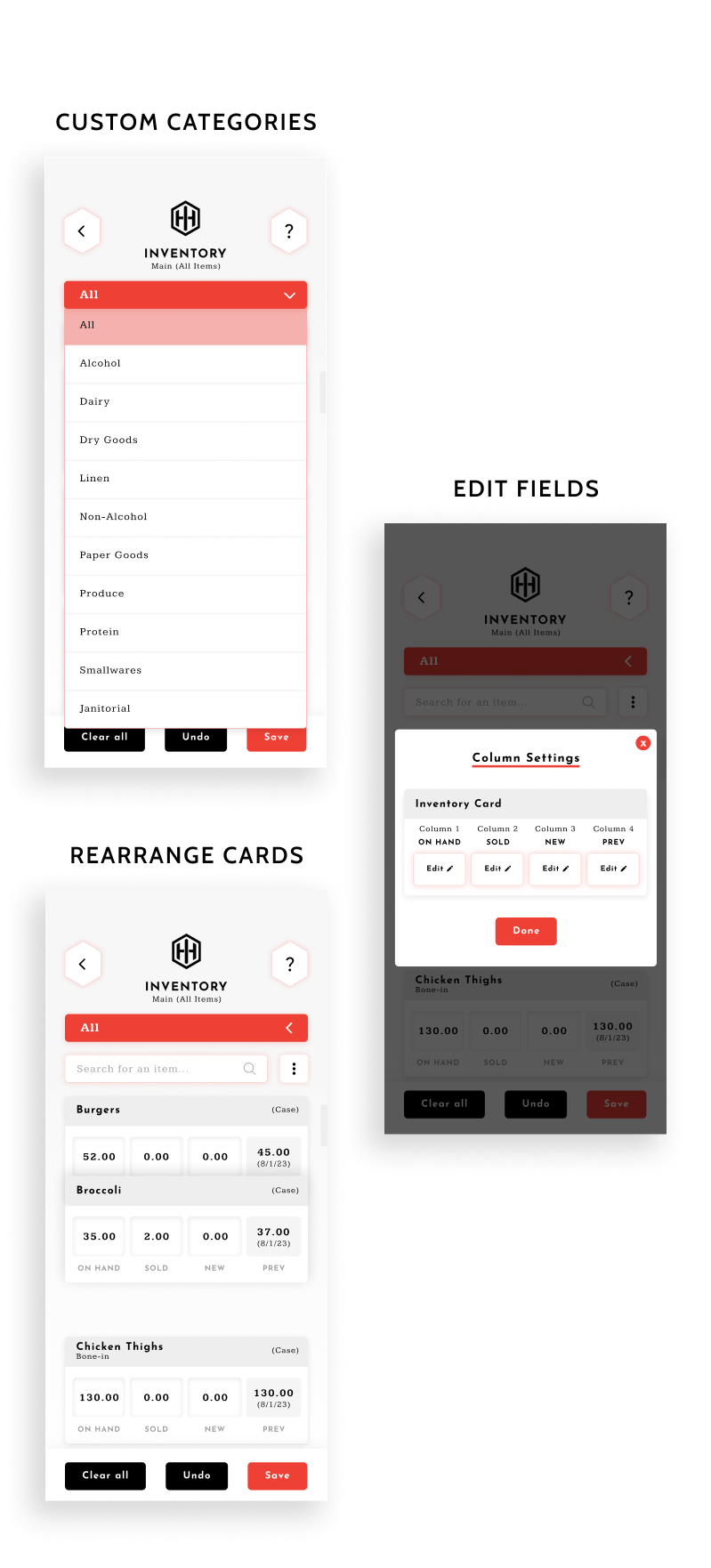
The user's inventory list is fully customizable. They can set up custom categories, change their card fields, and reorder their cards as they please. This allows the user to organize their list in a way that matches the order in which they count their items.
After clicking into an inventory card, the item will open up in a pop-up menu that allows the user to solely focus on what they're editing.
They then have the option to combine multiple counts, which allows them to sum many counts into a cumulative total, cutting down on mental math. This is especially useful for chefs that keep the same items in multiple locations.

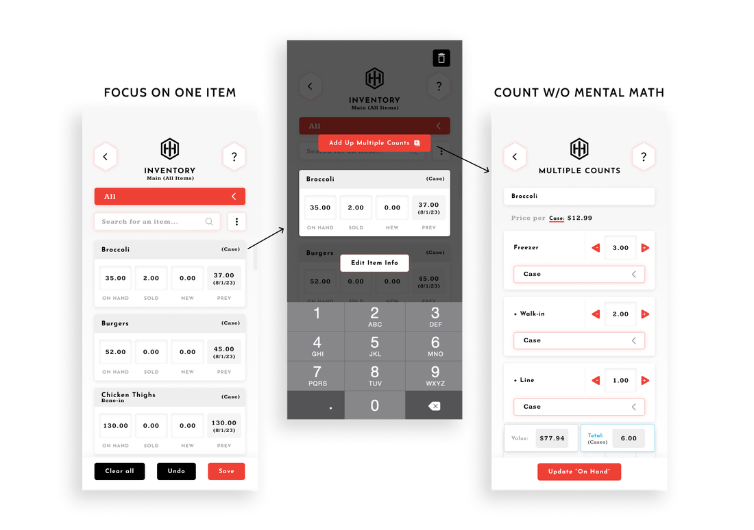

With this design, our clients can count inventory at minimum 50% faster.
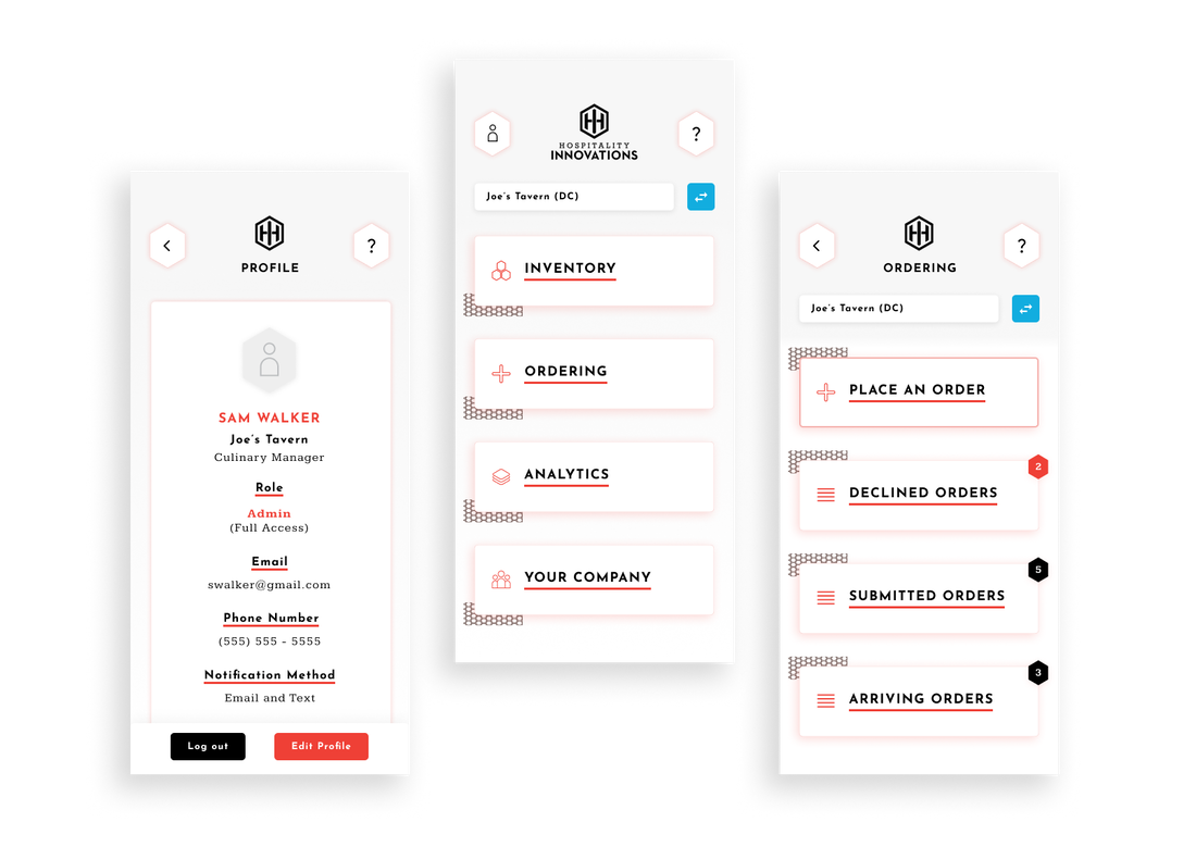
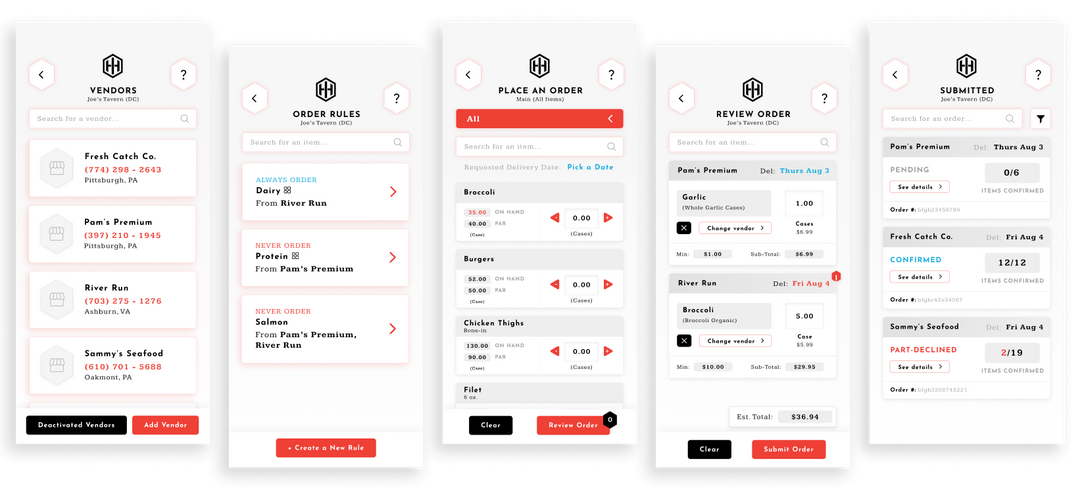
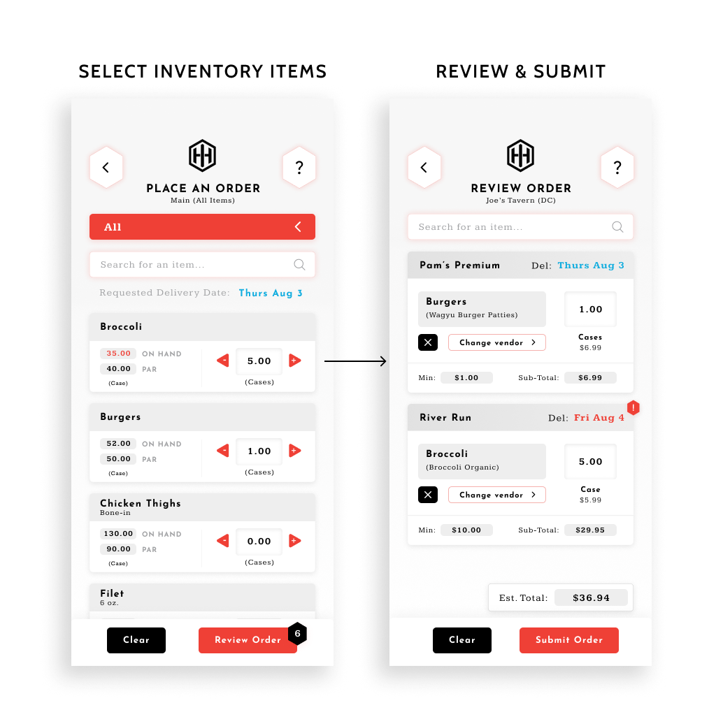
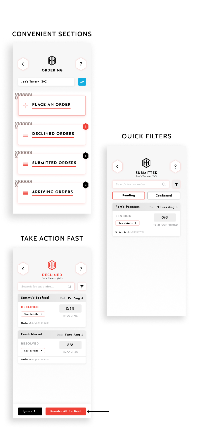
Place new orders in just two steps.
With the familiar layout similar to the inventory screens, the user can easily jump into placing new orders. The screen displays all of their inventory and categories as their inventory section, so they simply type in the amounts they need, or use the quick increase or decrease buttons.
Then they just hit 'Review Order' in the same place that they would save their inventory, and they can see their requested items automatically matched with their approved vendors.
This is a far-cry from sifting through pricing lists for each vendor one-by-one, then ordering on different systems or on paper.

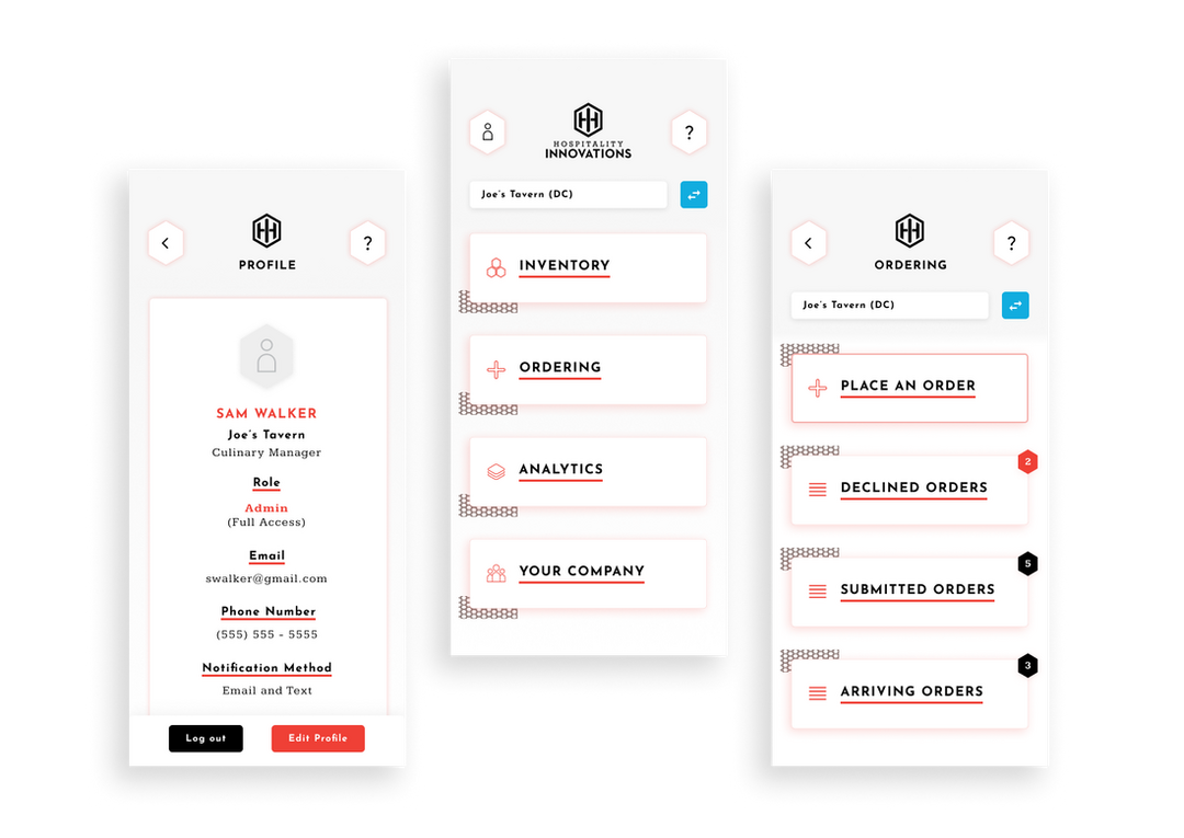
Track orders and take action in one place.
Check the status of any order, at any stage. Orders are split up into three sections, so users can target the orders they really want to look at. From Declined Orders, Submitted Orders, and Incoming Orders, the user can view order details and take any necessary actions, such as reordering a declined order, contacting a vendor for a still-pending order, or confirming the delivery of an order that arrived.
The layout remains the same as inventory, so navigation is intuitive. Each page is also fit with quick filters to help narrow down longer lists. This is a vastly better system than the typical sifting through emails, spreadsheets, and physical invoices to manage orders.
The layout remains the same as inventory, so navigation is intuitive. Each page is also fit with quick filters to help narrow down longer lists. This is a vastly better system than the typical sifting through emails, spreadsheets, and physical invoices to manage orders.
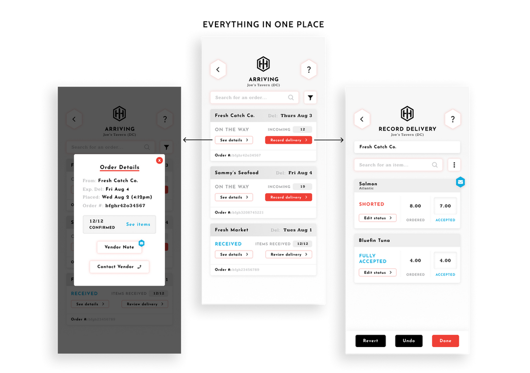
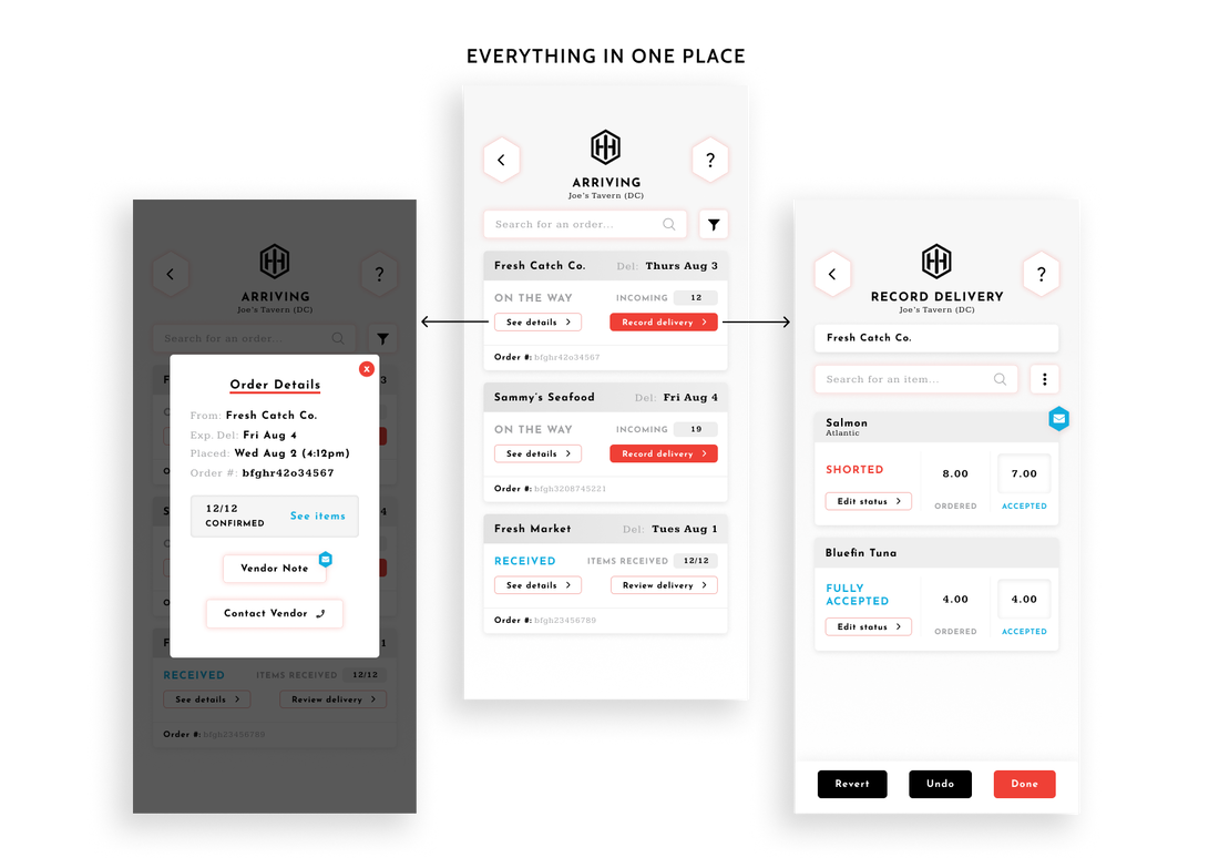

Clients have all of the information needed to make informed purchasing decisions right at their fingertips. Optimizing profits has never been simpler.
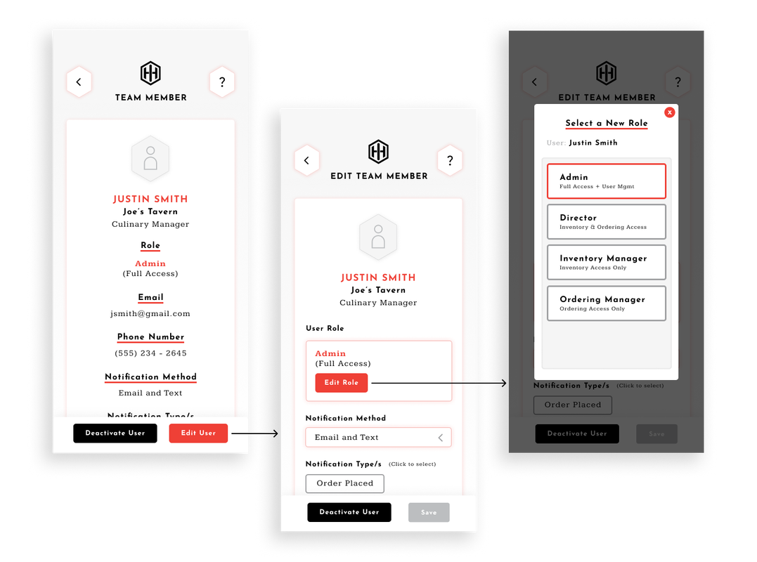
Seamlessly manage the team.
Teams are always changing, and the hospitality industry has especially high turnover. That's why on Hospitality Innovations, it only takes a couple clicks to update their status.
Team members also have varying levels of feature access. Admin users can easily update other users' access guided by handy descriptions for each role. A common use case is setting some users to Inventory-only if some cannot be entrusted with the ability to order items.
Team members also have varying levels of feature access. Admin users can easily update other users' access guided by handy descriptions for each role. A common use case is setting some users to Inventory-only if some cannot be entrusted with the ability to order items.

Adapting to the instincts of hospitality workers.
After each iteration, I presented the designs to the software development team for insights on feasibility and efficiency. After those adjustments, I conducted tests using UserTesting and with clients to identify further improvements. Here are some examples of changes I made based on testing data:
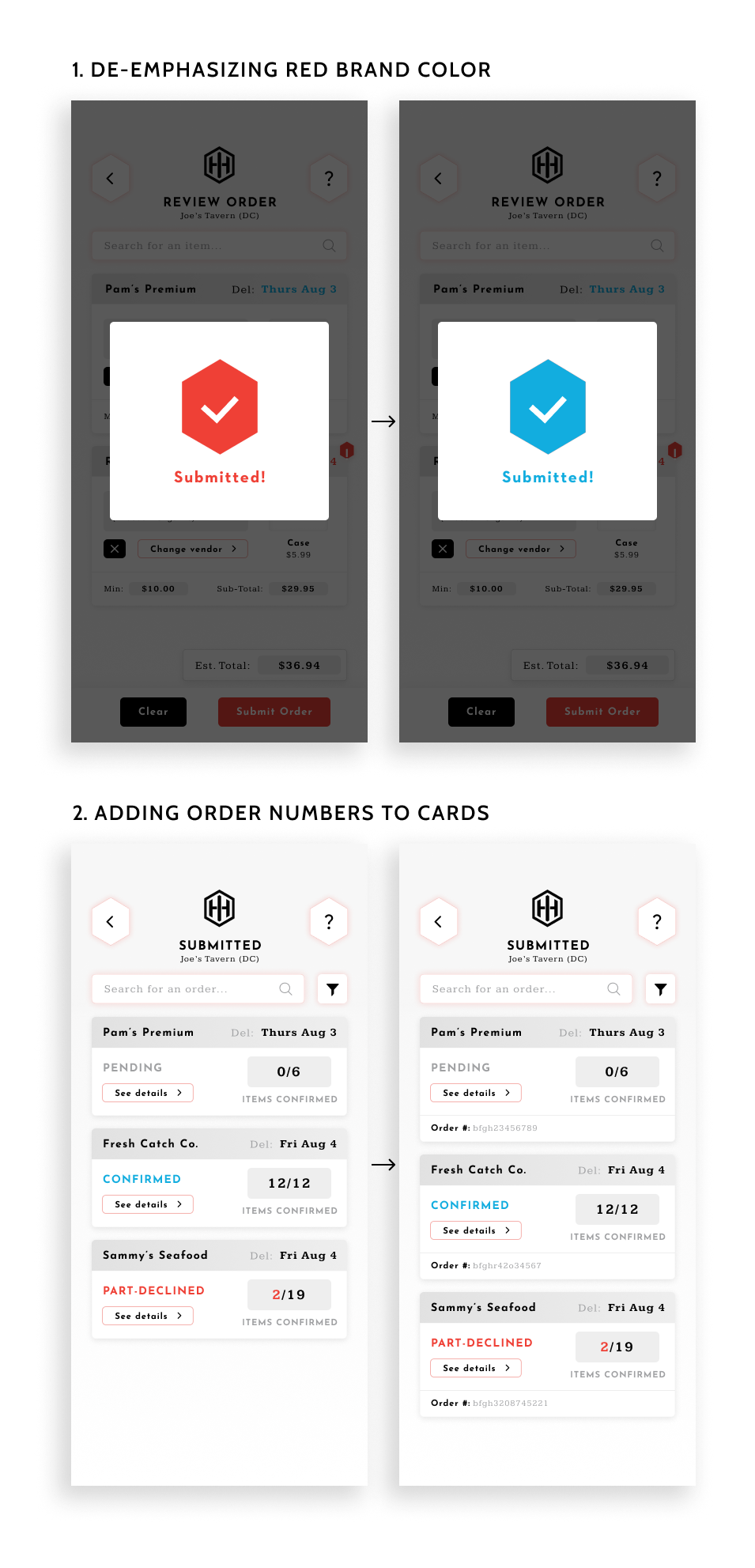
1. Further de-emphasized the red brand color because some users' first reactions were that red meant something negative had happened.
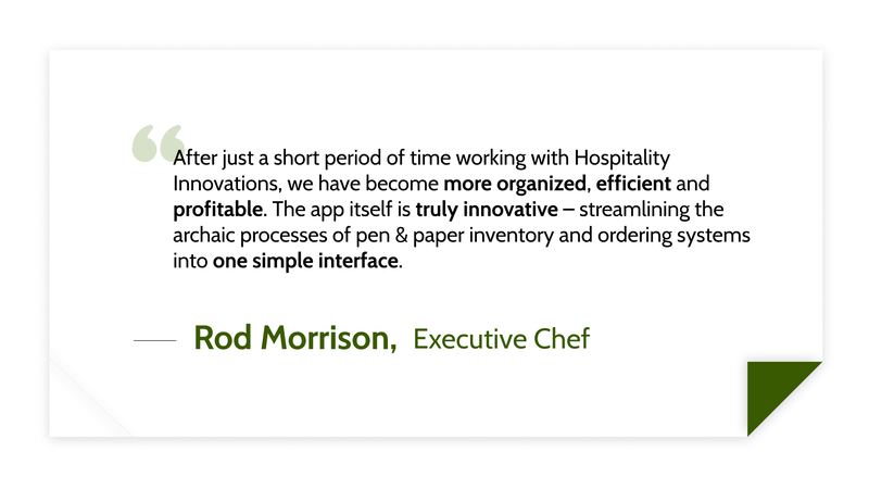
2. Added order numbers to cards rather than keeping them in the order details popup. With the order numbers moved out onto the cards the screen was more cluttered, but users found it more convenient this way. (A good lesson that minimal isn't always better)
Other testing highlights:
1. Further de-emphasized the red brand color because some users' first reactions were that red meant something negative had happened.
2. Added order numbers to cards rather than keeping them in the order details popup. With the order numbers moved out onto the cards the screen was more cluttered, but users found it more convenient this way. (A good lesson that minimal isn't always better)
Other testing highlights:
- Testers were asked to rate how aesthetically pleasing our app was on a scale 1-5 (5 being best). Our average score was a 4.4.
- Testers were also asked to rate how easy to use our app was on a scale 1-5. Our average score was a 4.8.
- Testers were also asked to rate how much they could trust our app appeared on a scale 1-5. Our average score was a 4.6.

Live prototype in action.
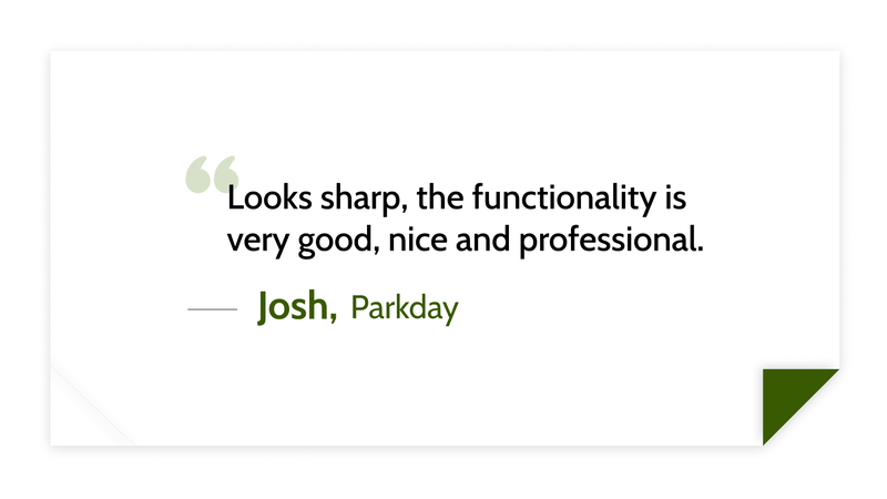
What hospitality workers think.
Here are some quotes from both prospective clients and current customers.
The responses were overwhelmingly positive:
The responses were overwhelmingly positive:
Strong UI/UX could change hospitality forever.
Technology that is pleasant to look at and easy to use would drastically change working in the hospitality industry. Tasks will be faster, less frustrating, and less prone to errors. This helps managers and chefs focus on providing impeccable food quality and service. It also creates a better working environment for higher staff retention.
No more hideous spreadsheets and agonizing over pen and paper scribblings. With the high-speed environment of working in hospitality, just one less thing to think about is incredibly valuable.
No more hideous spreadsheets and agonizing over pen and paper scribblings. With the high-speed environment of working in hospitality, just one less thing to think about is incredibly valuable.
Why stop there?
Next: Adapting Hospitality Innovations into a seamless web experience.